|
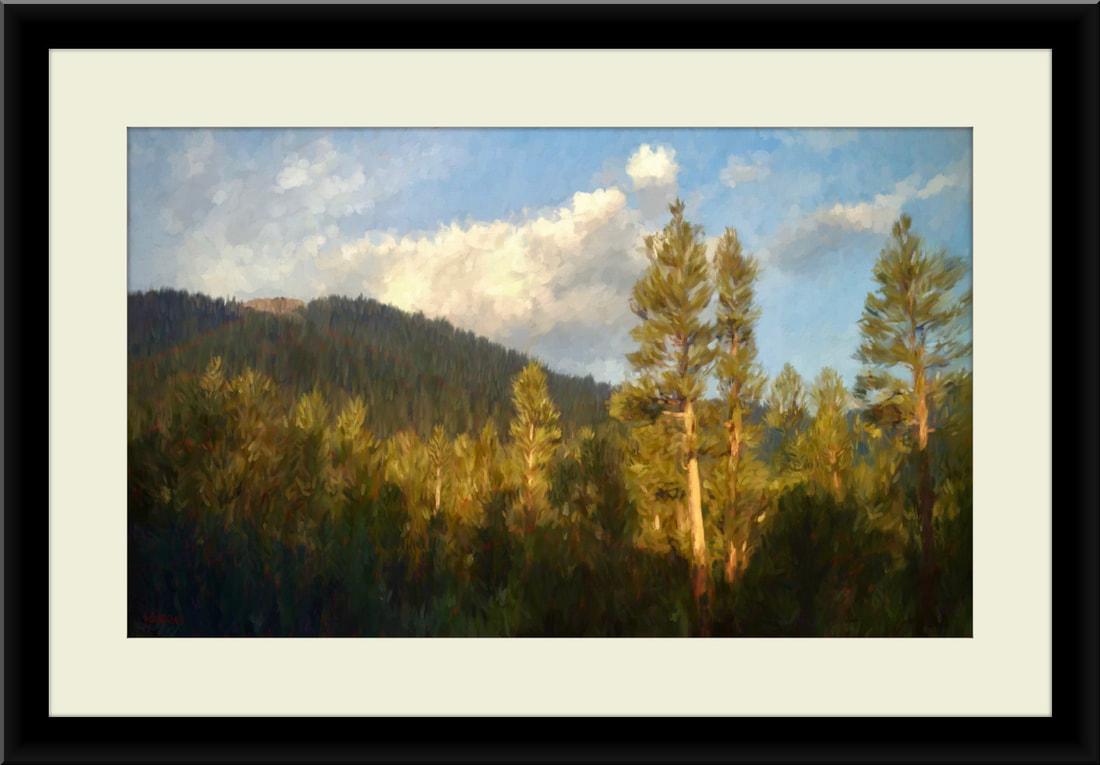
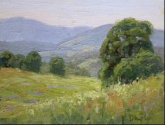
Rod Moore and Kathleen Dunphy. Here are two screen prints of two very similar paintings. We can learn from this:
I will now list what are the takeaways from these two images, listed by value areas, based upon my opinion:
Rod's painting took about 45 minutes to paint via a video. You can tell that Kathleen's took longer since she added much more detail. Both are wonderful paintings with a different approach. I like Rod's painting very much considering it took him such a short time to paint. His video of how he painted it is awesome. Here is a link to the video.
Kathleen's painting is artist quality where as Rod's is just a smidgen of Bob Ross. But Rod's painting blows away anything that Bob Ross ever did! Rod's painting took just 45 minutes to paint. Think about that for a second. If he had just added 20 more minutes to his painting, in a few key places he would have been competing with a world class artist. Painting a painting a day does give artists that chance to fine tune that craft. Rod's work shows that. Great work by both artists that I someday aspire to approach.
0 Comments
Is how you hold the brush dependent on how you want to paint your paintings? Most of the impressionist painters I am watching on the Internet appear to hold the brush from the end. And, in some ways uncomfortable so. Is there logic in the way it is being held? Being able to stand as far away from the painting as is possible is one reason. And it does work. My last painting I reminded myself to step back and paint as far from the painting as was possible. It did seem to help with the illusion. 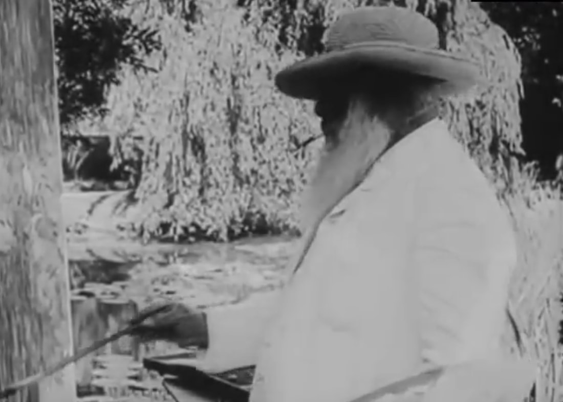 Claude Monet It may force the painter to "not" be able to create fine details? All of the photo realistic painters I am watching hold their brushes like pencils. They are the same distance from the painting as a writer is. Michael James Smith, an English realist holds the brush like a pen/pencil  Michael James Smith Vladimir Volegov (A fantastic artist!) sometimes does hold the brush up tighter but I think this is because he sits while he paints. He mostly paints mid-brush or at the end of the brush. I never see any pencil holding here.  Vladimir Volegov The take away (I think) from this post is as follows:
I am new at this "painting stuff". Ignore the FNG in the room! As I get older and my eyesight is waning I am finding that lighting is critical for me. I just received the light below from Amazon ($95) and I think I really like it! It is 5,500k temperature, it has removable lenses (a set of white and yellow lenses are included for temperature control), movable via the tripod, has an iPhone holder for art photos, and a dimmer for the exact correct amount of light. So far so good! If I decide not to keep it I will update this post. It looks stupid as hell in the room but it is a tool. And, this is serious art stuff we are talking about here! 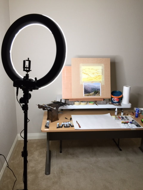 My Janesville painting is my favorite painting, and I need to do more paintings "just like that one". How do I get there? Here are my objectives:
 It has really been a month since I posted? Shame on me... I plan on doing a few posts in the next few days. Here is my first one. My painting setup in Reno is an after thought and I was tired of it looking real bad. So, using Kathleen's "Painters Taboret" setup that she uses; that she purchased from Wind River Arts it dawned on me that I could use a poor mans setup. Here it is: 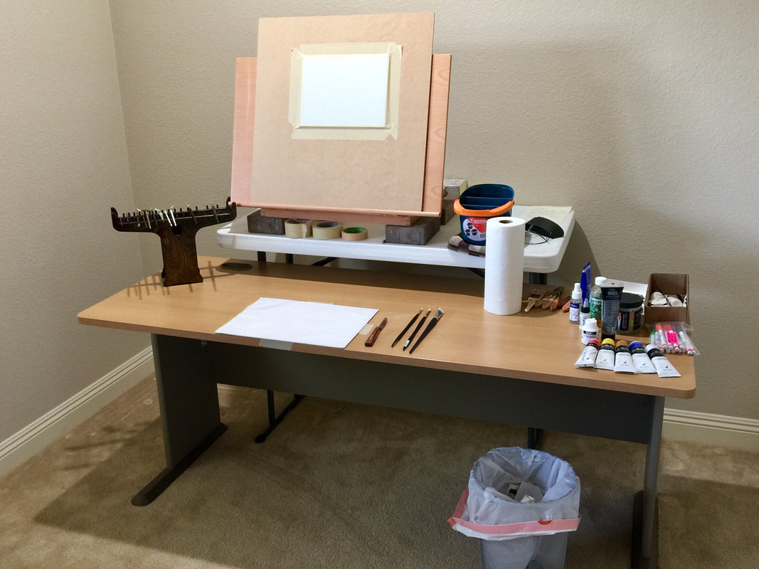 Notice the similarities to theirs?
I have two larger, "paper pallet blocks" (18"x 24") arriving on Tuesday and I am excited to add them to the surface. I have not decided if I am going to mount them with tape in a horizontal or vertical format. I plan on painting this evening and trying the setup out. This will lead me to my next post and the topic I am looking forward to sharing, tomorrow. It is a huge post and it "must" be said! Using what I can find about Kathleen Dunphy's toned canvas, which is not a lot, I have attempted to approximate her toned linen canvas. The palette photo below is the best one I can find with what color she tones her canvas with: 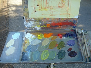 Kathleen Dunphy's toned linen canvas Below is what I came up with for my first Dunphy study. I used Liquitex Heavy Body Cadmium-Free Yellow Light (30% mixture) and Liquitex Basics Titanium White (70% mixture). You can see the tubes on the right. I did notice at first that I started with a higher mixture of yellow than is required so don't over do it with the yellow! Her image has a little bit of a bluer tone to the canvas than mine does. I am not sure if it is the Internet photo that is doing this or not. I cannot find any where on the Internet what color(s) she is using for her standard "day-light" toned canvases. If anyone who reads this who has taken her workshop and wants to comment on this then please do! I plan on making a post on her blog asking what color she is using to tone her canvas. Here is my quick take on the color: 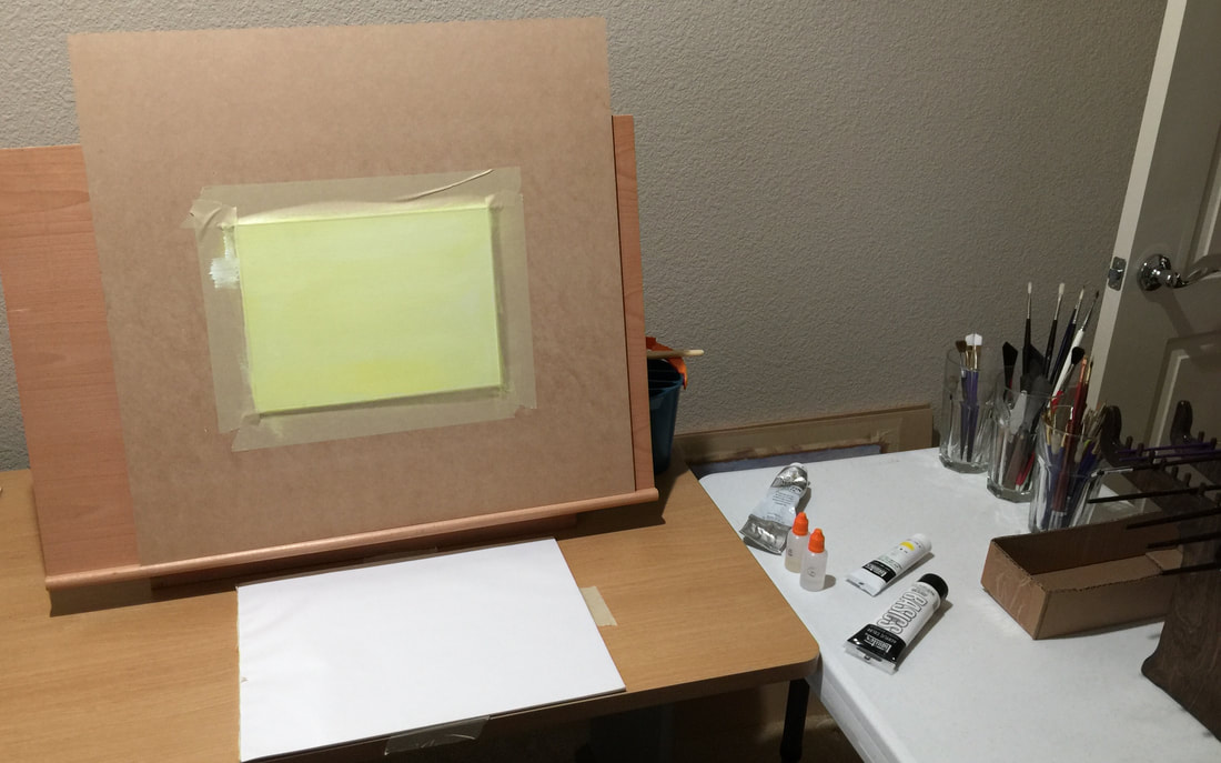 Tomorrow, I plan on finding a nice mountain stream to paint via an image I get from Pixabay or Pexels. I will use the Permanent Red Medium that she uses to sketch in the painting (like she has done above). Then on Tuesday, when my paints come in that match hers, I will start my studies. I ordered two different Titanium whites (Rembrandt Linseed and Safflower) but I am not so sure I will use those. I may instead use my T-White W & N Griffin Alkyd paint instead. It dries so much faster than the Rembrandt paints I am sure. I will try and find the time tomorrow to post an image of my "sketch" before I start the actual oil painting. Wish me luck! As I go through my journey, and continue to make stupid mistakes...
I plan on updating this one and only post with "my" tricks that seem to work for me. This may not work for you since everyone is different. Totally: and I mean totally, subject to change! 1. Current paints that I am using (Thank you Kathleen Dunphy):
Sizes: 8, 10, 12 - Winsor & Newton Artists' Oil Color Brush, Long Handle Bright Sizes: 00, 0, 1 - Winsor & Newton® Artists' Oil Color Brush, Long Handle Round 3. Fredrix Canvas Pads in different sizes. Someday, when I am more confident in my work, I will start painting on pre-stretched Linen canvas or Gatorboard panels. 6x8 or 12x16. 4. I prefer mounting my paintings to a 1/4 inch piece of MDF, 2 x 2 foot board with "tan" masking tape holding the canvas to it (you can see an image of it in the post above). This allows me to move the piece around to work on different paintings at any given time. The board is held in place on any easel. 5. Gamsol or Chelsea Classic Studio Lavender Spike Oil, for slight thinning of the paint on the palette. I use the Spike oil during the winter months since I cannot open up the windows to let fresh air in. Original Post Date: 12/08/2018 Consider reviewing this post by Kathleen Dunphy and what she wants her students to use in her workshops: http://artaspens.com/artaspens/zp/index.php?p=pages&title=kathleen-dunphy-materials-list |
Robert HopkinsThanks for stopping by! Archives
May 2019
Categories |

 RSS Feed
